White Rabbit
Brand Identity Design & Website Design
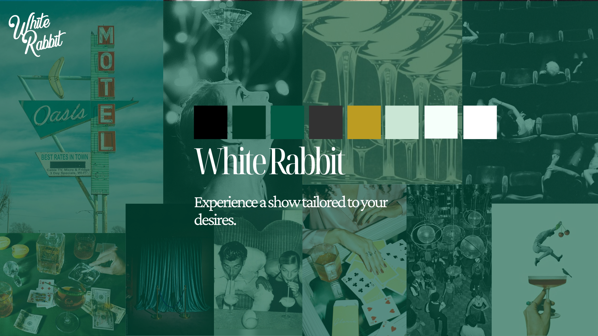
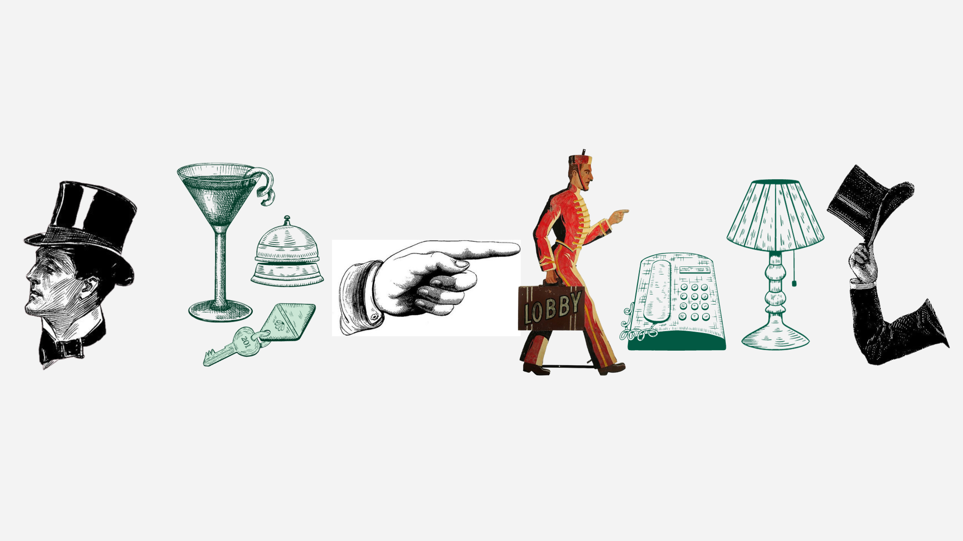
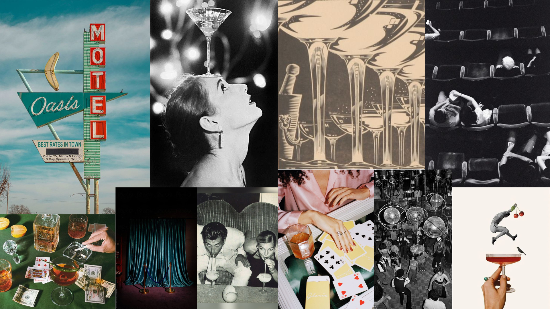
Tasked with crafting a distinctive brand identity for a Los Angeles-based magician, the project embarked on a journey of fusing vintage aesthetics with modern design sensibilities. The creative direction was significantly influenced by the whimsical and elegant aura of old Hollywood and your favorite hotel lobby, which seamlessly aligned with the magician's persona and offerings. The initial exploration phase delved into a variety of visual inspirations, from classic sketches and vintage color schemes to modern yet timeless typography.
The color palette was meticulously chosen to encompass red, green, and gold, mirroring the elegance and whimsical charm reminiscent of a bygone era, while resonating with a modern audience. Typography selection followed a similar ethos, opting for font pairings that blended contemporary clean lines with classic stylings, ensuring a visual narrative that was both fresh and nostalgic.
The imagery was bold and evocative, drawing heavily from the luxurious and magical ambiance of vintage hotel lobbies and the mystique surrounding old Hollywood. This visual language was carried through every aspect of the design, from the website's user interface to the promotional materials, ensuring a cohesive brand experience that transports the audience to a realm where magic and modernity coalesce.


This project showcased a deliberate and thoughtful approach to integrating historical aesthetics within a modern design framework, ultimately delivering a brand identity that is as enchanting as it is contemporary. Through a blend of vintage inspirations and modern design principles, a visually compelling and thematically consistent brand identity emerged, ready to captivate the magician's audience in Los Angeles and beyond.
